Safety Net Colors and Aesthetics: Choosing the Perfect Match for Your Home
Complete guide to safety net colors and aesthetic considerations. Learn how to choose colors that blend with your home while ensuring safety.
Safety doesn't have to compromise aesthetics. Choosing the right color for your safety nets can enhance your home's appearance while providing essential protection.
Why Color Matters
Visual Impact: Safety nets are visible additions to your property. The right color choice ensures they:
- Blend seamlessly with architecture
- Maintain aesthetic appeal
- Minimize visual prominence
- Enhance rather than detract from design
Psychological Factors:
- Light colors create spaciousness
- Dark colors provide contrast
- Neutral tones offer versatility
- Color affects perception of safety
Available Color Options
Standard Colors:
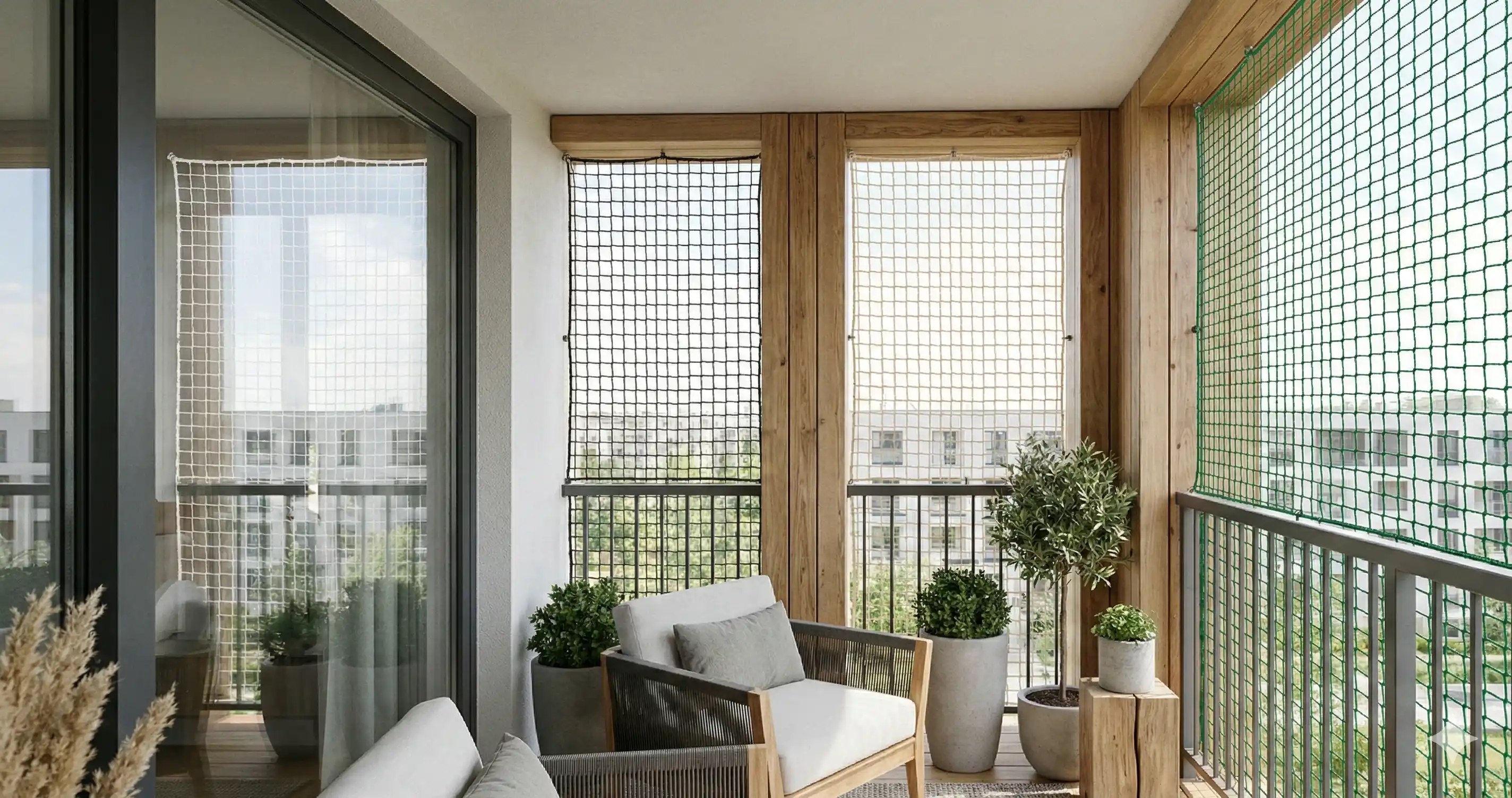
- White (Most Popular) Advantages: ✓ Neutral and versatile ✓ Matches most building colors ✓ Reflects sunlight (stays cooler) ✓ Shows cleanliness (easy to spot dirt) ✓ Brightens spaces ✓ Universal acceptance in societies
Considerations:
- Shows dirt and dust
- Requires regular cleaning
- May yellow over time in polluted areas
Best For:
- Light-colored buildings
- Modern architecture
- Maximizing brightness
- Standard aesthetic preferences
- Black/Dark Gray Advantages: ✓ Subtle and less visible from distance ✓ Hides dust and dirt better ✓ Sophisticated appearance ✓ Good for modern design ✓ Excellent contrast definition
Considerations:
- Absorbs more heat
- More visible on light walls
- May feel confining in small spaces
- Shows bird droppings more
Best For:
- Dark building facades
- Contemporary architecture
- Areas with high pollution
- Industrial aesthetics
- Green Advantages: ✓ Blends with natural surroundings ✓ Calming visual effect ✓ Good for garden-facing areas ✓ Pleasant aesthetic ✓ Moderate heat absorption
Considerations:
- Less common, may have lead time
- Specific architectural match needed
- May not suit all building colors
Best For:
- Garden-view balconies
- Buildings with green elements
- Natural settings
- Eco-conscious aesthetics
- Transparent/Clear Advantages: ✓ Maximum visibility ✓ Minimal visual impact ✓ Works with any building color ✓ Modern appearance ✓ Doesn't obstruct views
Considerations:
- More expensive
- Shows all dirt and debris
- Requires frequent cleaning
- Limited to certain net types
Best For:
- Premium aesthetics
- Unobstructed view priority
- Modern minimalist design
- High-maintenance acceptable
- Custom Colors Some suppliers offer:
- Beige/Cream: Warm, versatile
- Blue: Coastal or nautical themes
- Brown: Traditional architecture
- Gray: Contemporary, neutral
Additional cost: 10-20% premium Lead time: 2-4 weeks typically
Matching Colors to Architecture
Modern Contemporary Homes: Primary Choices: Black, transparent, white Aesthetic Goal: Clean lines, minimal visual clutter Recommendation: Black for dramatic contrast, transparent for invisibility
Traditional Architecture: Primary Choices: White, beige, brown Aesthetic Goal: Complement classic design Recommendation: Match predominant building trim color
Mediterranean Style: Primary Choices: White, cream, terracotta-adjacent tones Aesthetic Goal: Maintain warm, inviting feel Recommendation: Off-white or cream for cohesion
Industrial/Loft Style: Primary Choices: Black, dark gray Aesthetic Goal: Raw, modern aesthetic Recommendation: Dark colors for authentic industrial feel
Minimalist Design: Primary Choices: Transparent, light gray, white Aesthetic Goal: Maximum simplicity Recommendation: Transparent for least visual impact
Building Color Coordination
Light-Colored Buildings (White, Cream, Pastels): ✓ White nets: Seamless integration ✓ Light gray: Subtle definition ✓ Black: Bold contrast (modern look) ❌ Avoid: Medium tones that neither match nor contrast
Dark-Colored Buildings (Brown, Dark Gray, Black): ✓ Black nets: Invisible integration ✓ Dark gray: Tonal match ✓ White: Dramatic contrast (if intentional design element) ❌ Avoid: Medium colors that look muddy
Multi-Colored Buildings: ✓ Match predominant color ✓ Neutral white or gray for versatility ✓ Consistent color across all nets ❌ Avoid: Mixing net colors unless design intentional
Practical Considerations
Climate and Environment:
Hot, Sunny Climates:
- White nets stay cooler
- Reflect rather than absorb heat
- More comfortable near windows
- Better for energy efficiency
Coastal Areas:
- Lighter colors better (shows salt residue less)
- Regular cleaning needed regardless
- Consider UV resistance over color
- Transparent options good for views
High-Pollution Areas:
- Darker colors hide dirt longer
- More frequent cleaning needed for light colors
- Gray as middle ground
- Consider washability in color choice
Maintenance Implications:
White Nets:
- Cleaning frequency: Every 2-3 weeks
- Visible dirt: High
- Professional cleaning: Annual
- Longevity of appearance: 3-4 years before yellowing
Black Nets:
- Cleaning frequency: Monthly
- Visible dirt: Low (except white bird droppings)
- Professional cleaning: Bi-annual
- Longevity of appearance: 5-7 years
Green/Colored Nets:
- Cleaning frequency: Monthly
- Visible dirt: Moderate
- Professional cleaning: Annual
- Longevity of appearance: 4-5 years
Transparent Nets:
- Cleaning frequency: Weekly-bi-weekly
- Visible dirt: Very high
- Professional cleaning: Quarterly
- Longevity of appearance: Depends entirely on maintenance
Society and Regulatory Considerations
Apartment Complexes: Many societies have color guidelines:
- Uniform appearance requirement (usually white)
- Building committee approval needed
- HOA regulations
- Check before purchasing
Recommendation: Verify permitted colors before ordering
Commercial Buildings:
- Brand consistency considerations
- Local regulations
- Customer perception
- Professional appearance standards
Aesthetic Enhancement Strategies
Creating Visual Harmony:
-
Match Window Frames: If window frames are white, choose white nets. Creates cohesive look.
-
Coordinate with Railings: Match balcony railing color for integrated appearance.
-
Consider Interior Views: From inside looking out, net color affects view:
- White: Bright, open feeling
- Dark: More muted outdoor view
- Transparent: Minimal view obstruction
-
Landscaping Coordination: Green nets complement garden views and plant-heavy balconies.
-
Architectural Details: Match color to other architectural elements (shutters, trim, awnings).
Strategic Color Placement:
Front-Facing Balconies: Consider street view and building aesthetic Priority: Match building facade
Rear/Side Balconies: More flexibility for personal preference Priority: Interior view and functionality
High-Floor Installations: From distance, color less noticeable More freedom in choice
Low-Floor Installations: More visible, coordination important Match building exterior carefully
Special Aesthetic Considerations
Invisible Grills: Unlike nets, invisible grills are naturally less obtrusive:
- Stainless steel cables (silver color)
- Nearly invisible from distance
- No color choice needed
- Aluminum frames available in colors
- Match frame to window color for best results
Cost Implications:
Standard Colors (White, Black):
- No additional cost
- Readily available
- Quick delivery
- Widest selection of quality grades
Custom Colors:
- 10-20% premium
- Limited brand options
- Longer lead time (2-4 weeks)
- May require minimum order quantity
Transparent/Special Materials:
- 30-50% premium
- Specialized suppliers
- Extended lead time
- Limited size options
Budget Recommendation: Standard colors offer best value without compromising quality or function
Future Considerations:
Resale Value:
- Neutral colors (white, gray) appeal to most buyers
- Unusual colors may limit appeal
- Quality and functionality matter more than color
- Well-maintained nets in any standard color are assets
Trend Longevity:
- Classic white never goes out of style
- Black has gained popularity (modern trend)
- Colorful nets risk appearing dated
- Transparent remains premium option
Replacement/Expansion:
- Matching existing color important for aesthetics
- Standard colors easier to match years later
- Custom colors may not be reproducible
- Consider future additions when choosing
Color Selection Decision Framework:
Step 1: Check Regulations
- Society guidelines
- Local building codes
- HOA requirements
Step 2: Assess Building Colors
- Primary facade color
- Window frame color
- Railing color
- Architectural style
Step 3: Consider Practical Factors
- Climate conditions
- Maintenance willingness
- Pollution levels
- Sun exposure
Step 4: Evaluate Budget
- Standard vs custom pricing
- Long-term maintenance costs
- Quality priority
Step 5: Personal Preference
- Within constraints above, choose your preference
- Consider both interior and exterior views
- Think long-term, not just current trend
Most Popular Choices by City:
Hyderabad:
- White (65%)
- Black (25%)
- Green (8%)
- Others (2%)
Bangalore:
- White (60%)
- Black (30%)
- Transparent (7%)
- Others (3%)
Vijayawada:
- White (75%)
- Green (15%)
- Black (8%)
- Others (2%)
Visakhapatnam:
- White (70%)
- Black (20%)
- Green (7%)
- Others (3%)
Expert Recommendations:
For Most Homes: White
- Versatile, bright, widely accepted
- Best compromise of aesthetics and practicality
For Modern Architecture: Black or Transparent
- Contemporary appeal
- Sophisticated look
For Garden-View Balconies: Green
- Natural integration
- Pleasant visual harmony
For Low-Maintenance Priority: Black or Dark Gray
- Hides dirt better
- Less frequent cleaning needed
Get Expert Advice:
Unsure about the best color for your specific situation? Contact Satya Safety Nets for:
- Free color consultation
- Sample viewing
- Visualization assistance
- Building-specific recommendations
- Service across Vijayawada, Visakhapatnam, Hyderabad, Bangalore
Remember: Safety is paramount. Color is important for aesthetics, but never compromise on net quality and proper installation for color preference. Choose certified, quality nets in your preferred color for best results.